Saturday, October 31, 2009

Old simple house plans - design inspiration

I posted an article the other day on gaining inspiration from old houses. Below is another great example - a bungalow that I stumbled upon near Forestville, California. It is so simple yet so well done. Why aren't builders and designers creating more homes like this anymore? Has the idea of doing a modest, simple and well detailed home escaped them? There must be a niche for this kind of house plan, but perhaps it's a lost art.

So here is the brilliant idea:
  • keep the overall form and roof line very simple - this costs less to build
  • use nice deep overhangs - this protects the walls, windows and doors from the elements
  • create a good composition of windows - here picture windows are combined with double hungs and centered between the porch columns and the wall surfaces
  • use minimal ornamentation - the window grid patterns and the exposed rafter tails are pretty much the extent of it here
  • create a focal point - the simple shed dormer with louvers and the stair that is "captured" with side walls helps to create a center line and create focus on the entry
  • give the house a base - the white clapboard siding provides a platform for the house to sit on and it contrasts nicely with the red shingle siding.

Thursday, October 29, 2009

Finding Design Inspiration in Old Houses

My better half and I just got back home from a short trip to the Napa Valley area. We don't really go for the wine, although that's nice too. For us it is really about the scenery. The area really has such a subtle beauty that we just love. On our trips I of course like to see the local architecture. I try to take snap shots of things I see that I might draw some inspiration from later on. Anyway I thought I'd show you an example from this recent trip and illustrate what I am trying to learn.
Here is a snap shot of the gable end of a historic home (the Kelley house) in Mendocino. I love the simplicity in form and the strength of it's details. This is a key to good design. If you have a simple form you need to pay attention to the details. Here are my thoughts:
  • The proportions of the gable are quite nice - neither too slender or too squat with roof pitch neither too steep or too flat.
  • I love the depth of the gable end roof overhang (this is called the rake end). The brackets underneath provide a sense of support for the overhang.
  • The crown molding at the fascia creates additional shadow line and adds a subtle detail.
  • A wide frieze board (that's the white trim on the wall below the overhang) provides a nice transition between the siding and roof overhang.
  • The siding lap is nice and narrow. The proportion of the entire gable would be altered if the siding had a wider lap.
  • I like the narrowness of the windows, and the fact the pair of windows are separated. Look closely and you can see a subtle little "pilaster" detail at the jambs and mullion. Also the trim at the head projects outward creating additional shadow line and interest.
  • One thing I don't care for here is that the upper windows are nearly identical to the lower windows. I would rather see a bit of hierarchy - with the lower windows being a bit larger and more detailed than the upper windows. Another thing that bothers me slightly is the upper window intrudes upon the frieze board. It looks a little "crowded".
All in all it's a very pleasant composition and I can take away some good thoughts that I can apply on a future design.

Wednesday, October 28, 2009

disco noir


: : my lovely friend .maiya. shared the website of a friend of hers who has recently launched a handbag and furniture line. I love their attention to detail and pop of color.
check out .disco noir.

Friday, October 23, 2009

fall trip

: : every year, around this time, a big group of our friends head up to a house on a river in new hampshire where we spend the weekend, hiking, reading, cooking, drinking and hanging out by the campfire outside. we have a great time! new hampshire is beautiful this time of the year. we're leaving in a few hours. I can't wait.

these photos from .toast. (via .kurbits.) really capture the fall mood.

bando black


: : .bando. has a new black label out. lovely pieces. however I do feel that their prices are a little excessive.

sanna


: : I LOVE .sanna annukka. Her new online store opens in November. Be on the look out.

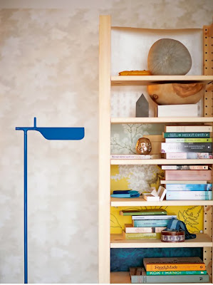
feeling yellow and blue


: : I like these images inspired by Sweden's colors, yellow and blue, by Lo Bjurulf for Elle interiƶr (found via .design delight.)

New Dutch Colonial House Plan Unveiled!

Simply Elegant Home Designs has just made the "Tonka Dutch Colonial" house plan available for purchase. The home was designed by Larson Brenner in Stillwater, Minnesota. Larson Brenner; who has been featured in a number of National and Regional publications has gained a reputation for designing charming and functional modestly sized homes. You can obtain more information on this house plan by visiting the following link:

Thursday, October 22, 2009

SHIFT Boston


There is a very cool competition happening in Boston. Read below. More information on SHIFT Boston's website .here.

THINK
PLAY THINK NEW THINK OUTSIDE THE BOX


The SHIFTboston Ideas Competition 2009 is calling on all innovators to submit the most provocative ideas for the City of Boston. SHIFT would like competitors to think: WHAT IF this could happen in Boston?

SHIFT seeks to collect visions that aim to enhance and electrify the urban experience in Boston. Innovative, radical ideas for new city elements such as public art, landscape, architecture, urban intervention and transportation. Competitors could explore topics such as the future city, energy efficiency and ecological urbanism.
YOU TELL US.

Monday, October 19, 2009

Revit House Plans

It's taken me a while but I am really convinced that Building Information Modeling (BIM) is the greatest thing since sliced bread. Traditionally buildings have been drawn using 2 dimensional CAD technology - or by hand drafting. But with BIM you create a 3 dimensional "virtual" model of the building. In order to communicate the design to client and contractors you then generate various views from the model (plans, elevations, sections, etc). I'll show you an example of how this works below.

Here you can see an axonometric view of the 3 dimensional model of this house plan. The model was created using REVIT software, by Autodesk.
Now I have "sliced" a view from overhead looking down onto the plan. What is great here is you can see the relationships between the various elements (windows, doors, trim and even furniture) so that you can better evaluate the design.


Here is another sliced view, but this time from a side. You can see the roof, ceilings and the decorative trusses.

The section below is just another "slice" taken from the model. The walls, floors roof and ceiling profiles are all in precisely the correct position. To make it into a construction drawing you just need to add the pertinent detailed information.

Here the virtual model has been exported into Google Sketchup, which is a great design tool. In this case all I did was added the materials, colors and a little entourage. Isn't this a better way to convey the interior design concept?
All images above are of the "Hudson Cottage" house plan which is available for sale at Simply Elegant Home Designs.


It takes a while to learn and become efficient at BIM. But in the end I am convinced it is a better way to understand your design, a better way to communicate the design and a better way to assemble the construction drawings.

Thursday, October 15, 2009

Afraid of Color?

apartment therapy - an interior design blog is having their fifth annual contest called "Room for Color 2009". In October they are looking for the most colorful, beautiful room on the planet.

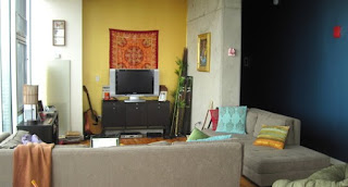
It's a good idea because adding color is one of the most affordable ways of changing a rooms character. But many of the folks are afraid of using color. Well as you can see from the examples below some of these folks really are not afraid at all.


photos courtesy of apartment therapy

You can see more entries at Room for Color. Check it out - you'll find lots of ideas. Some bold and crazy; and some simple yet sophisticated.


Wednesday, October 14, 2009

Housing Industry Needs to Reinvent

The housing industry (builders and designers) is in dire need of a new system / approach to building. I'll list a few reasons here:
  • Construction costs and land / development costs have gotten out of control in recent years.
  • The housing bubble has dramatically dropped the value of our homes.
  • The fact right now is that you cannot build a new home inexpensive enough to compete with the glut of existing homes on the market.
  • If we are seeing an economic recovery it's a small one - and the job market is not expected to improve for several years.
  • New buyers are having difficulty getting loans or do not qualify for enough loan to build the kind of house they might have a few years ago.
  • Home buyers are becoming much more aware of "value".
  • Home buyers are increasingly environmentally conscious.
  • Home buyers are more "hip" and expect good design and construction quality.
So what the people want is a really cool, sustainable, well constructed cheap house. Is anyone out there providing that? Or is this an impossible combination?

Indeed, times are tough and it is truly a time of survival of the fittest in the housing market. The housing industry needs to pull their collective head out of the sand and adapt. I believe that the industry needs to look at things fresh and perhaps create an entirely new business model.

In looking for new ideas I have looked to old ones. What about the old days when a fellow purchased a house from Sears Roebuck Company? The house was shipped to them and they built it themselves, or had local tradespeople construct it. Why did that business model go away? One reason I think is because people stopped being handy. They no longer had the skills to put anything together as complicated as a stick framed house. Even if they could it would take forever; and banks don't like that.

Enter a new system devised in Germany called HIB. HIB is a building block system that goes together like Lego's. They say that the simplicity and speed of putting the system together makes it an ideal candidate for an owner built project. The company also touts the product's insulating capabilities, sustainability and economy.
Sounds too good to be true honestly. But I am inviting a company representative in to discuss the product further. I'll let you know what I find out.


Monday, October 12, 2009

Really Small House Plans

I have alerts set up to tell me about new posts relating to house plans and home design in general. Lately I have been receiving many alerts relating to tiny house plans. It must be a sign of the times. Many of these tiny homes are so small that I really cannot see how anyone can live in them. They have taken the idea of restrained living to the extreme (for an example see new small house plan available today) . There seems to be a competition over who can create the tiniest home.

But recently I ran across a company called "Reclaimed Space" where I found a couple of their prototypes to be quite nice. Their niche seems to be creating very well crafted really small homes - but not necessarily tiny. These are sort of studio apartment sized homes. And they are really nice - trimmed out with recycled lumber, corrugated metal and other fine finishes. Now these are the kinds of tiny houses that I could actually see myself living in.

Check out the photos below. If you want to see more go to reclaimed space .

one of their modules en-route

eating / kitchen area

kitchen
bed area

Sunday, October 11, 2009

Rio 2016 Olympic Images


This post is not related to house plans or home design but I thought would be interesting for everyone. As you know Rio De Janeiro has been awarded the 2016 Olympic games. The Architectural firm of BCMF Arquietetos was responsible for envisioning the Olympic environment. I have included a few of the images they created. Some pretty cool stuff.


Chicago is a pretty nice town, but it is difficult to imagine a more dramatic backdrop for the Olympic games than Rio? I am looking forward to watching in 2016.

If you want to see more Rio Olympic images you can go to the official Rio 2016 web site

Thursday, October 8, 2009

in and out burger

: : uhm....I just love this .flickr photo. it's probably the bright contrasting colors. it's making me hungry. time for dinner.

photo and card inspiration


: : pretty vintage rose cards from .nest pretty things. and a wall of inspiration from .simply photo. I'm also loving blues at the moment.

Monday, October 5, 2009

swedish home


: : swedish home inspiration from newfound blog .desiretoinspire.

Vinyl siding done not so ugly!

Vinyl siding is hated by most Architects and by many quality home builders. It's bad rep is deserved for the most part - I'll list just a few reasons:
  • limited choice of colors - usually shades of beige
  • looks flimsy
  • seams are obvious
  • all those j-channels around windows and doors look terrible and not authentic
On the other hand vinyl is inexpensive. And nowadays everyone is trying to find a way to construct a house plan less expensively. So in the interest of being fair to vinyl siding I am posting a link to a Fine Homebuilding Article entitled "8 ways to make vinyl siding look it's best" (just click the link). If you use all 8 of the tips I would dare say you can have a vinyl siding done not so ugly!


My favorite tip is on how to eliminate the J-trim. The J-trim I think is one of those things that really makes vinyl stand out as vinyl. If you can eliminate or reduce it's use now you can have a siding installation that looks much more authentic.


By the way I have one more tip that's not listed in the article. Tip number 9 - Don't Use Beige. Next to J-trim, Beige is the biggest thing that makes vinyl look like vinyl. The CertainTeed website has a useful took called ColorView which can help you visualize various color combinations. I did the image below very quickly using that tool. I would suggest keeping the color scheme simple when using vinyl. Keep it all white or do a simple scheme of one body color with a contrasting trim color (such as below).