Showing posts with label Windows. Show all posts

Saturday, September 11, 2010

Not Exactly a Farmhouse

I've been meaning to write the second half to my previous post:    

New Windows: Part I.   Well, here it is!  I'm sure you're excited, so let's have at it...


I have a project that is just finishing up (and for sale) and it dawned on me that it's a good case study on how to get the most of your new windows.  Last time I talked about different manufactures and window types...  this time I want to look at how to 'use' those windows.  This particular house has beautiful views of the countryside in upstate New York, so the windows were an important part of the design.  


From the front porch and a long bank of windows, you can see the vista beyond...  


Many rooms in this house have big areas of glass to enjoy the surroundings, but from the road we wanted the house to present itself as an iconic image of a farmhouse.  A gabled end with punched windows...  meaning that they are situated independently and appear as 'punched holes' in the wall. 


Because the floor to ceiling heights are much greater than in a historic farmhouse, the windows had to be oversized to provide the proper proportion of window to wall.  The composition of this front elevation and the simple organization of the window and door arrangement were critical to create an understated but rich farmhouse image. 


Once you approach the house from the drive, you see the house starts to open up with larger areas of glass. When you gang the windows together it becomes a window wall rather than individual windows as seen on the front facade.   Here on the south elevation we used an awing to cut down on the southern exposure during the summer months.


In some areas we played with the scale of the windows.  The bigger square window on the right is a focal point at the end of the porch and the small window to the left balances the composition.  Its slighter scale also enhances the wall's textural quality.


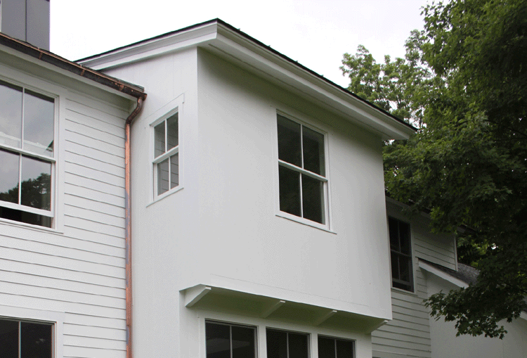
A generous window is centered in a second story bay.  Cladding this element in a monolithic material (vertical boards with tight joints) gives importance to its form and simple but prominent windows. 


At the interior, a grouping of windows at the first and second floor accentuates the height created at the staircase.  


The double height space over the dining area is flooded with southern light thanks to the window wall at the stairs.  The soft indirect light highlights the stonework of the fireplace chimney.


The first floor windows at the stair bring light down into the lower level.  No need for your basement to feel like a basement! 


Because we are in the country it allowed us the opportunity for generous windows in the bathrooms, which are filled with light.  If you happen to have neighbors, that's what window treatments are for! A sheer shade or drape can still offer lots of light and give you the privacy you may need.  I am particularly fond of shower windows... just make sure you have a good tile job on the surround and I suggest an exterior grade paint on the sash. 


Here's another bathroom with an entire wall of windows that creates an open backdrop to the Duravit soaking tub...


Having windows at the end of a hallway expands the interior of the house to the outside and helps with orientation... its one of those things that makes you feel more comfortable without even knowing it?!   Also, if you can have windows along a hallway it makes moving through your house that much more pleasant.  A connection to outdoors shouldn't be just for vacations!


Okay, so these aren't windows... they're screens on a double height porch space.   But they beautifully frame the views to the outside just like the rest of our windows.  We kept the proportion of the openings the same as the windows inside the house so they relate to one another.


In this house we used only one window type, the double hung.   But by using it in different ways we can provide unique experiences while maintaining an overall consistency throughout the house.   


 I hope to post more photos once the finishing touches are complete!
  

Friday, May 14, 2010

Splitsville

I'm really excited about a current project of mine...but you might think I'm joking, 'cause it's a split-level!  Yes, that ubiquitous housing type that was created during the suburban sprawl boom of the 50's and 60's.   Here's one we all know and love...


Brady Bunch house as of 1995        Photo: Flickr


Actually this house is much more interesting than the split-levels we have back here on the east coast; most of our look more like this...


 Photo © Kenneth Sponsler / iStockPhoto.com


I found this picture on About.com where they catalog images of a different styles of residential architecture. You might want to check it out if you ever wondered what's a 'raised ranch' or a 'shotgun house'? 


Well, now all the split-level housing stock is coming of age and is ripe for renovation with lots of young families trying to make them their own. So yeah, I'm excited... and intrigued by the thought of reinventing something that is everywhere and needs reinventing!


I decided to see if anyone else had taken on the challenge and I found a nice example from a back issue of Dwell. Their approach is similar to one that I want to take... open up the interior and introduce big windows.  Sounds simple but I think it could make a huge difference.  Also in the article they talk about trying not to disguise or alter the configuration of the split level... make it something it's not.  I like the idea of preserving its form and just rethinking how it might feel and work for a modern family.


All these images and more can be found on the Dwell website article, 'On the Level'.


Photos by: João Canziani


These giant sliders really open up the space and because the rooms are open to one another you get light from all sides making it feel even bigger.  Lesson here...you don't need more square footages just larger windows!


The minimal detailing also makes the space feel light...not weighed down with trim.  I particularly appreciate how the sheetrock meets the concrete stair.


I found the following image from another Dwell article, Bellemo & Cat's Cradle.  I thought this illustrated how opening up the wall between the levels will create a more expansive space... and a fun place to hang out too!


Photo by: Prue Ruscoe


Here's another split level that has been given a new life; and lots of light too...


Can you believe this brilliantly bright space can be found in Oregon?  A feature on this home can be found on Portland Monthly.  The kitchen feels great too.  I think it's because there are no upper cabinets so the kitchen feels like part of the living space.  All you need is a wall of cabinets to the side and you've got plenty of storage.  (hint, hint to my clients... ditch the upper cabinets!)


All these bright airy images make me want to move to the burbs and buy a split-level. Well, almost... maybe for a weekend home?!  


A good childhood friend of mine grew up in a split-level... I spent many hours playing games on that shag rug in the lower level!  I won't go into the scary adolescent details, but... maybe you have some fond split-level experiences you'd like to share?

Friday, May 7, 2010

Wall of Curtain


I took this photo the other day of the kids hanging out in the windows.  It's their favorite spot and rightfully so. 


Even though I snapped it on a whim to capture a childhood moment, it also happens to document the first 'design move' I made on our house.  It's a simple one, but bears mentioning... the Wall of Curtain. 


Here's a photo we took when the realtor first showed us the house.  Hard to believe it's the same space!


You can see how the built-in bookcases remediate a bump in the wall but then this offsets the windows... this bugged me.   The quick remedy... cover the whole wall with sheers to keep the light coming in but take the attention away for the openings themselves.  And thanks to West Elm's linen panels, the solution was an economical one too!


It's such a beautiful sunny morning here; I just had to take another photo. I should also mention that I wanted to use a rich color on the wall (Benjamin Moore- Davenport Tan) but didn't want to darken the space. The sheer curtain lightens up the wall and offers a nice contrast.


To all you moms out there... I pushed the toys to the other side of the room! 


Hope you have a fun house project planned for the weekend.  We're going shopping for a kitchen counter....Happy Mother's Day to me!


Wednesday, March 3, 2010

New Windows: Part I

In a previous post, I showed some images with black window sashes... and that got me thinking about windows.  I like a window sash that contrasts with the trim and the walls... windows are such a great detail feature, why not make them stand out.  Like we did here with stained Douglas fir windows...


But before I go there... I thought maybe I should talk about getting the right windows first!  Whether you're building your own home, renovating, or just putting in replacements ... it's a tough decision.  Windows are usually the biggest ticket item on any construction project.    And they should be.  In my mind, it's worth the extra amount to get a superior window.  Here's why... you want a window that will...  a) function properly for years to come,  b) be energy efficient to increase comfort and minimize your utility bills, c) and most importantly... look phenomenal!   A good looking renovation starts with the windows. 


We used Pella windows on this project under construction in Old Chatham, NY... the oversized windows are a predominant feature in the design.


Loewen is another step up and has beautiful wood windows.  I particularly like the push out casements they offer.  No annoying crank... they feel European.


And the interior screen 'door' is a great feature...


Another type of window similar to the casement is the 'tilt-turn' window.  In this case, the window swings in and the screen is on the outside.  It operates much like a door but it also has the 'tilt' option where the whole unit angles inward to allow for ventilation at the top. They come in large sizes so you can have expansive views.  In this project we used tilt-turn Marvin windows which allowed for big windows that were operable so the whole space could be open to the outdoors.


Photography by Elliott Kaufman


Anderson is another popular brand. It's a good standard window at a modest price point.  However, they only come with a vinyl exterior and have less design versatility. Also in my experience they do not have the longevity of some of the other more expensive brands.  Here's a great application of Anderson windows on a beach house in Rehoboth, DE...


But when we converted the screened porch to a three-season room, we used Marvin Magnum double hung windows... you can get them super sized!


So if you're starting to plan a renovation, take some time when considering your window options. Next time we'll talk about how to get the most out of your new windows!