Showing posts with label interiors. Show all posts

Saturday, January 29, 2011

Kiddywompus!

I recently received a post from Remodelista in my email and it featured this great way to display kids art.  I have piles of my daughter's drawings and this inspired me to 'someday' put together a project like this. 


It makes me feel better that I'm holding on to oodles of artwork, some of which are not much more than squiggles...but you never know what might look fantastic once photographed, shrunk, cut into a square, and arranged with other colorful squiggles! 


The site led me to the creator of the collage, Jan Eleni, an interior designer in New York. Here's another display of children's artwork and a whimsical bedroom...


This adorable little girl's room got me looking through my archive of other children's rooms that I found inspirational...


I love the simplicity of this room and that it could be for a little boy or girl.  I found this image and bunch of other sweet kids rooms at House to Home


Children's rooms are the best for having some design fun. Here are some other kid room ideas that I have found in the past and would love to copy for one of my projects!


Corkboard wainscoting panels scale the room to little tots and it's another great way for kids to display their artwork that piles up. 


Via the Scoop


Chalkboards are another great way to have fun in a kid's room.  I like the color scheme in this boys room and the band of chalkboard coupled with the map... oh yeah, maps another great idea. 


Kids Room Projects Map Murals

Via HGTV


Supposedly you can make your own chalkboard paint and the DIY: Project website has the recipe.  If anyone wants to try it, let me know if it works! Otherwise here's a safe option from Restoration Hardware... 


Marseilles Chalkboard
 Restoration Hardware


Another great map... this one is a decal which is an easy way to dress up a children's room.   This one can be found at Weego Home. 


World Map Decal

And storage... you can never have enough for a kid.  Here's what we did to even out a bump in our wall and give ample shelf space for our daughter's toys and books.  More photos of the room can be seen on my website.    


The discreet under bed storage in this Ikea bed is a huge bonus... you don't want to know how much we've got packed in those drawers!   


I could go on and on about storage for kids rooms.  But I'll leave that for another post... anyway, I've got to get started framing my kids artwork... 

Friday, December 31, 2010

10 Design Topics for 2011

Another year has come and gone.  We asked our daughter this morning if there was anything she didn't get to do this year... 'cause today is the last day!  She replied that there's always next year.  Well, I guess that's true but most of the time I feel like we're trying to cram one more thing in the day just to cross it off the list.


So in that spirit, here's my last blog post of the year.  Over the past months, I've compiled tons of inspiring photos for client discussions and many would make great blog posts.  Here are few photos on each topic and you tell me what you'd like to read more about in 2011!


1. Built-in shelving along a fireplace wall...


2. Painting an interior brick wall...


3.  The inspiring work of residential architect, Joeb Moore...


4. Not your grandma's drapes...


5. Thinking about bunk beds for a cozy cottage retreat...


6. Kid's rooms and built-in beds...


7. Kitchens with fireplaces... 


Darryl Carter's Townhouse featured in Elle Decor


8. Another inspiring residential architect, Mark Hutker...


9. Dark sash steel windows...


Design by William Hefner


10. There is something about a white bathroom...


Designed by Joeb Moore


There you have it... my first top 10! And to think I woke up this morning wondering what there was left to write about.  So please cast a vote... or my next post might be in 2012!  (Wen, I'm talking to you...)


It's hard to believe that I started 2010 with my first blog entry.  It feels so long ago and I'm in a different place now... as we all are.  The events and moments of the year have added to who I am and the work I do.  Its fun to look back at what I was thinking about from month to month.  I've enjoyed the process and I hope you've enjoyed reading.  Thanks to all of you who have followed my blog this past year.  I appreciate all your comments and positive feedback.  Here's to 2010 and what 2011 might hold for all of us! 


Have a Happy New Year! 

                          -Jennifer Marsh

Saturday, September 11, 2010

Not Exactly a Farmhouse

I've been meaning to write the second half to my previous post:    

New Windows: Part I.   Well, here it is!  I'm sure you're excited, so let's have at it...


I have a project that is just finishing up (and for sale) and it dawned on me that it's a good case study on how to get the most of your new windows.  Last time I talked about different manufactures and window types...  this time I want to look at how to 'use' those windows.  This particular house has beautiful views of the countryside in upstate New York, so the windows were an important part of the design.  


From the front porch and a long bank of windows, you can see the vista beyond...  


Many rooms in this house have big areas of glass to enjoy the surroundings, but from the road we wanted the house to present itself as an iconic image of a farmhouse.  A gabled end with punched windows...  meaning that they are situated independently and appear as 'punched holes' in the wall. 


Because the floor to ceiling heights are much greater than in a historic farmhouse, the windows had to be oversized to provide the proper proportion of window to wall.  The composition of this front elevation and the simple organization of the window and door arrangement were critical to create an understated but rich farmhouse image. 


Once you approach the house from the drive, you see the house starts to open up with larger areas of glass. When you gang the windows together it becomes a window wall rather than individual windows as seen on the front facade.   Here on the south elevation we used an awing to cut down on the southern exposure during the summer months.


In some areas we played with the scale of the windows.  The bigger square window on the right is a focal point at the end of the porch and the small window to the left balances the composition.  Its slighter scale also enhances the wall's textural quality.


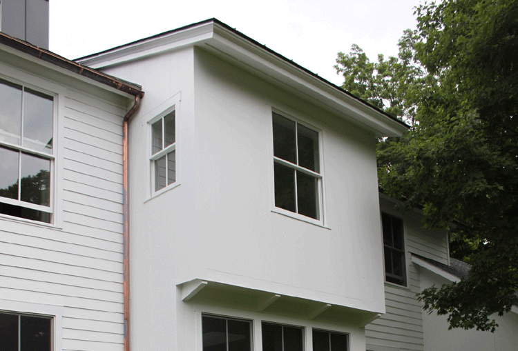
A generous window is centered in a second story bay.  Cladding this element in a monolithic material (vertical boards with tight joints) gives importance to its form and simple but prominent windows. 


At the interior, a grouping of windows at the first and second floor accentuates the height created at the staircase.  


The double height space over the dining area is flooded with southern light thanks to the window wall at the stairs.  The soft indirect light highlights the stonework of the fireplace chimney.


The first floor windows at the stair bring light down into the lower level.  No need for your basement to feel like a basement! 


Because we are in the country it allowed us the opportunity for generous windows in the bathrooms, which are filled with light.  If you happen to have neighbors, that's what window treatments are for! A sheer shade or drape can still offer lots of light and give you the privacy you may need.  I am particularly fond of shower windows... just make sure you have a good tile job on the surround and I suggest an exterior grade paint on the sash. 


Here's another bathroom with an entire wall of windows that creates an open backdrop to the Duravit soaking tub...


Having windows at the end of a hallway expands the interior of the house to the outside and helps with orientation... its one of those things that makes you feel more comfortable without even knowing it?!   Also, if you can have windows along a hallway it makes moving through your house that much more pleasant.  A connection to outdoors shouldn't be just for vacations!


Okay, so these aren't windows... they're screens on a double height porch space.   But they beautifully frame the views to the outside just like the rest of our windows.  We kept the proportion of the openings the same as the windows inside the house so they relate to one another.


In this house we used only one window type, the double hung.   But by using it in different ways we can provide unique experiences while maintaining an overall consistency throughout the house.   


 I hope to post more photos once the finishing touches are complete!
  

Saturday, July 24, 2010

Great Design Resource

Now that summer is in full swing (and whoa, is it swinging!), I've cut back on all the extra stuff I do (like blogging!) and I'm sticking with what has to be done.  However, I have continued to follow one blog... Remodelista.


When I first started Cattywompus, I thought I should check out what's out there in the blogging world so I signed up for a load of feeds.  And Remodelista always manages to inspire me above the rest.  Almost every time I look at it I find something that is relevant to my work, home or own personal style.


It could be something as simple as coat hooks...


Or maybe house numbers...


Or even a fancy trash can.  This compost pail can be found in their 'Domestic Science' section!


I particularly like their 'Steal This Look' features where they show you enviable images like this one and then give you tips on how to make it your own.


I get Remodelista Daily sent to my email and even though I swear I signed up for the weekly recap, I do get it everyday (yeah, like the title states!).  The funny thing is... now I'm happy when it arrives and I always look forward to opening it.  I find the posts highly visual with just the right amount of info that I can quickly scan to see if I'm interested in delving a little deeper.  Like today they featured these beautiful chairs that feel so beachy to me.  Ahhhh, to be on the water on a hot day like this... the soft blue color almost make me feel cooler?!


Or like the other day, these great brick tiles had me checking out the latest on the Waterworks website...


Not only do they talk about great products they also inspire with good design and beautiful imagery.  I had mentioned Remodelista on my Double Island Counters post.  They featured a light filled kitchen in Brooklyn... which is one of my favorites.  


It's just a well packaged website, that I find simple, inspiring and informative.  If you're in the process of renovating or hope to do it soon... it's a great way to see good stuff to consider for your own project. 


Where do you get design inspiration for your home?